Subway
Brand identity for the classic cookie
Subway’s cookies are regarded as the top-tier sweet snack in the fast food world. Some would go as far to say that they’re more iconic than the sandwich chains’ subs themselves. So, when Subway approached us to give this iconic menu item a packaging refresh, we turned this into an opportunity to create a distinctive brand identity for this globally iconic cult classic cookie.
The challenge from Subway was clear. Cookies have always been such a key part of a Subway guest’s experience, so it was important to create an identity that was as memorable, and joyous as the fast-food cult-classic itself.
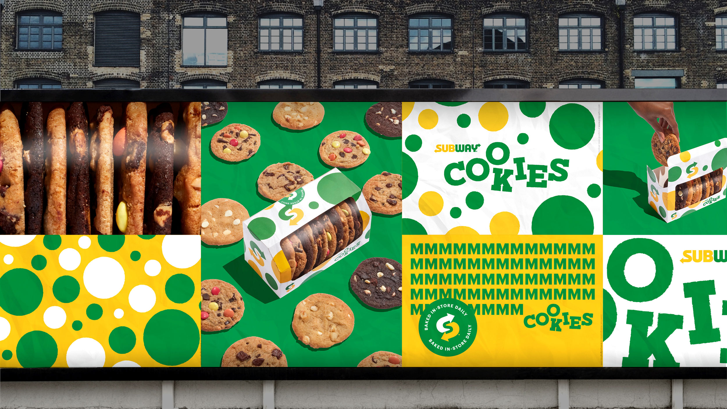
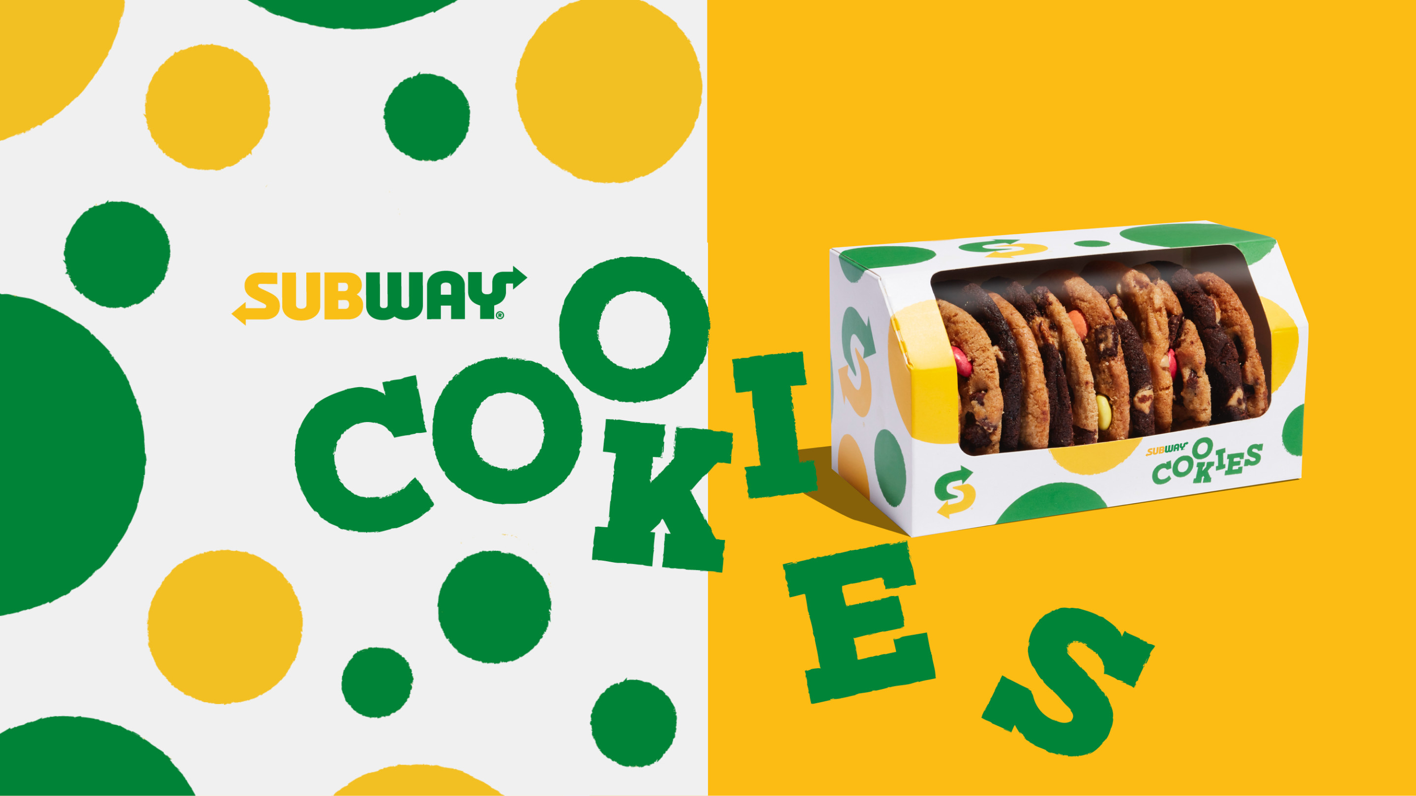
Our resulting EMEA Subway Cookies identity comprises a handful of “freshly-baked” elements – taking traditional patterns and typography, and applying the same oven baked treatment that the cookies themselves receive in store daily.
This identity started with creating a typographic “COOKIES” logo-marque. We used Subway’s house typeface and gave it a slab treatment – reminiscent of ‘50s American diners famous for all things sweet, nostalgic, and comforting. We took the letterforms and laid them out like cookies on a tray with a loose and fun arrangement, applying a rough “baked” texture to the edges of the marque.
The idea of bringing the freshly baked story to life extends through to our playful polka dot pattern used across packaging and beyond. Like the cookies themselves, each circle is completely unique in shape, size, and edges, allowing us to create bespoke patterned environments for different elements live in.
Staying with the iconic green and yellow colourway, the branding is strikingly simple and instantly recognisable for Subway – that was so important as the identity is being rolled out across 14 different markets in the EMEA region.
Design Agency |
Above+Beyond |
|---|